
Managing Tax Revenue
✧
Managing Tax Revenue ✧
B2B
B2C
…
Implemented by 65+ government agencies across the United States and Canada, RSI’s product facilitates the collection and processing of over $5 billion in tax revenue each year. Over two contracts, we took on a complete redesign of a legacy product and produced a MVP/proof of concepts on a brand new product in under 8 weeks.
With our designs, customers reported a 50% increase in employee productivity, a 60% reduction in manual work, and a 25% improvement in decision-making with revX analytics, resulting in a 55% increase in total audit findings, a 46% increase in average findings per audit, and an increase in the total collected revenue by over $750 million per year.
Finance
Accounting
My Role
Principal UX Designer with oversight from the Director of Design & rendering by a Visual Designer
Timeframe
Phase 1: 12 weeks, Phase 2: 8 weeks
SaaS
Government
The Problem
Facing a complete overhaul of their most popular product and launching a new product targeted towards new users, RSI tasked us with:
Completing a system re-build of their original product, Revenue Premiere, to a SaaS product, NextGen, with the goal of creating a flexible framework that will not only house massive amounts of data, but also surface information and relationships associated with specific user roles and tasks.
Developing a new, brandable, public-facing portal for consumers, RevX Online Services portal, to deliver assets and Proof of Concept/MVP with an 8 week turnaround, which was to be developed and go live the following month.
The solution
The NextGen tax solution will make the collection and processing of money simple and intuitive by focusing on tasks and task management rather than raw data and data associations, highlighting information and relationships associated with specific tasks and past activity.
The RevX Online Services portal will make the collection and processing of money easier for business owners, taxpayers, and tax preparers by providing a trustworthy, modern way for users to manage payments, file returns, and make service requests with an interface that feels personalized without sacrificing professionalism.
“These platforms should enable us to reimagine how some of these processes might work in a truly digital age.”
how we did it

1
Expert Review


24
Users and Stakeholders Interviewed

4
Product Demos
Discovery Activities
We took a mixed-method approach to the Discovery phase by conducting an expert review, watching a demo of the current product, and interviewing users, stakeholders, directors, project managers, and developers with key insights into the product ecosystem, allowing us to capture a well-rounded view of the system requirements, user tasks, pain points, and context of use.
From these insights, we were able to identify recurring themes, framework issues, and opportunities for improvement.
9
User Roles Defined
defining User Roles
Through our varied methodologies, we defined 9 user roles, including:
Managers — Decision makers, direct the assignment of work
Tax examiners — Work exceptions and correct errors
Customer service representatives — Answer phone calls and create work items
Auditors — Manage data entry and review history of likely non-compliant taxpayers
Collectors — Send correspondence and track cases
Taxpayers (Individuals) —Concerned with getting their refund
Taxpayers (Businesses) — Concerned with being compliant
Tax preparers — Manage taxes for others, often dozens of clients
Local taxing authorities and other agencies — Collect taxes through their jurisdictions
Our designs included views that were role-specific, tailored to the needs and behaviors of each specific role, but the limited scope required us to prioritize which users to focus on.
For the integrated NextGen tax solution, we decided to focus on tax preparers, customer service representatives, and managers. For the public-facing RevX Online Services portal, we focused on individual taxpayers, business owners, and tax preparers.

For each user, we defined their key responsibilities, typical behaviors, pain points with the current system, and how they prioritize their work.
Mismatch in Product vs.Expectation
Product built around raw data instead of completing tasks & tracking cases.
Biggest problems to solve
Error Prone Data
Incompatibilities between the system data structure and the real world requirements.
-
The system fails when data tracking doesn't match real world needs (when a payment is posted vs. when it is added to the system, any changes made to forms), which causes mass exceptions, processing errors, and data clean up work that grows exponentially over time, especially if it’s not caught early on.
-
The system requires a lot of knowledge to use, specifically workarounds with bugs, data entry, and where to find what they are looking for.
Data errors require users to memorize workarounds, allocate dedicated teams to correct issues, and manage increased customer service call volume due to automated system errors. Users do not trust the system, resulting in abandonment for error prone tasks.
-
Having to keep track of every case and entity a user is responsible for is almost impossible, meaning that cases are constantly falling through the cracks, which adds to the users workload because they have to deal with the consequences for their initial error.
-
There are entire teams of people that are responsible for managing data quality and correcting errors in automated tasks.
lack of transparency
Users have no insight to how the system works, causing constant confusion.
-
When small errors are not caught early on, they can cause an avalanche of negative consequences, increasing the user’s workload with repetitive, unnecessary tasks.
-
Uncertainty about which forms are required, how to fill out complex forms, and about how the system calculates balances leads to easily avoidable user errors.
-
Users want to be able to make changes to the system themselves to deal with errors more quickly and to optimize their workflows, but there is a fear of changing things because changes often cause more hidden errors or bugs and can have large, unknown impacts.
-
Users need to be able to track money from the moment it enters the system to the time it leaves, but a lack of transparency in specific calculations and delayed implementation of exceptions or changes make it difficult to keep track of the money.
-
People are looking for contextual information to evaluate a work item and determine next steps. Because this information is spread across multiple pages, it becomes a manual process to collect and remember the relevant data, massively increasing the user’s cognitive load.
-
Poor prioritization and functionality in the messaging, reminder, and workflow features force users to manually keep track of the status of their tasks, and whether or not their changes are reflected accurately within the system, which can cause cases to fall through the cracks.
-
Tasks are highly repetitive in the current system and content is spread across many pages, with a navigation structure that is hard to follow. Seemingly small inefficiencies like load times & click counts result in massive slow downs in workflow processes. When on the phone with upset tax payers or tax receivers, these delays are even more critical.
-
Users are forced to go through pages of data as they look for specific pieces of data to answer their case-driven questions. As they explore, they often lose their place and struggle to refer back to the previous point. The system does not allow referring to multiple things at once, so jumping back and forth is required.
“I spend a lot of time making sure nothing falls through the cracks... I try to keep track mentally, but I’m jumping from thing to thing.”
“The harder and the less intuitive your law and policy and forms are, the more likely [users] are to not comply, either because they just simply didn’t understand or because they’re just going to throw their hands up and say ‘Who’s got time for that?’”
“I had to go through so many screens — and the entity, account, and collections screens all look the same... Where am I?”
ideation process
Leveraging the requirements and opportunities for improvement defined in the Discovery phase, I began sketching potential solutions alongside two supporting designers. The scope of the sketches ranged from feature-level to framework-level thinking, and included designs for tax examiners, managers, and customer service representatives for NextGen, and designs for taxpayers, tax preparers, and business owners for the RevX Online Services portal.
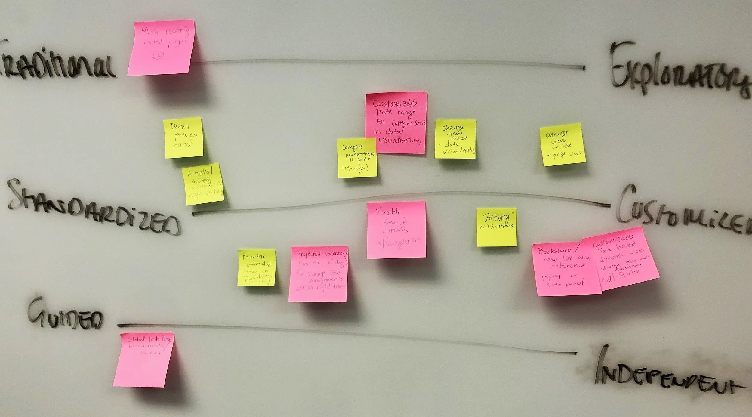
When we came together, we discussed our concepts and pulled out common themes and ideas, writing them on post-it notes and organizing them along several concept tension models—Traditional vs. Exploratory, Standardized vs. Customized, and Guided vs. Independent.
From the concept tensions models, we created two conceptual design directions—a guided, action-based design and an exploratory, object-based design—which we presented to our client to get feedback on the design and features they preferred, informing the framework development and further design iterations.
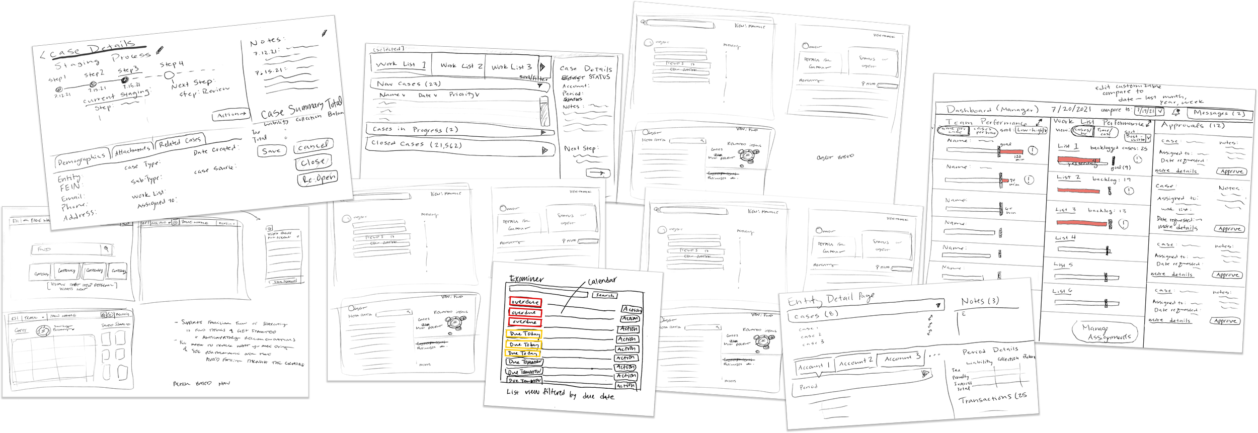
A few of the sketches that inspired our designs.
Capturing our ideation process in-progress.
conceptual design
Modernizing the platform
One of the goals of this project was to modernize the platform and adapt to the needs of “the next generation of taxpayers.” Some of the ways we accomplished this include:
Creating both mobile and desktop versions of the RevX Online Services portal, as younger users largely prefer to use their phone to complete tasks.
Creating light and dark modes for all of our designs, giving the user the option to choose which one they prefer.
Adapting the language used throughout the platform to be more natural and approachable without sacrificing professionalism.
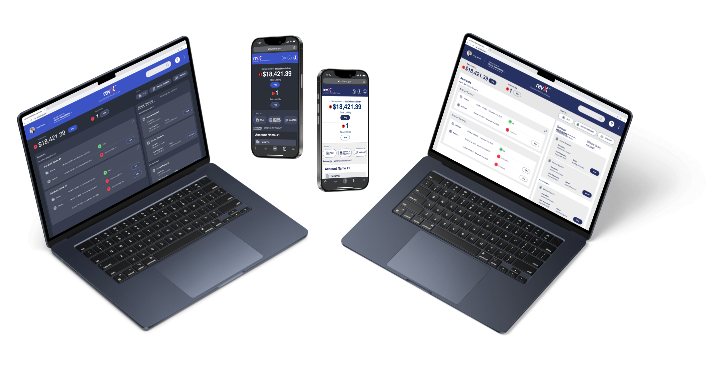
This wireframe prototype walkthrough portrays the user logging into the Online Services portal, paying an outstanding balance, filing a form, and reviewing their accounts on the dashboard.
a comprehensive visual language
Our visual language will help users understand the status of a large number of objects at-a-glance, allowing them to hone in on relevant information when scanning large data sets.
Throughout the platform, priority is the most important aspect to communicate, so we used the loudest indicator—color and shape—to represent it, reserving secondary iconography to explain the “what” and “why.”
Activity defines the icon used and priority defines the shape of the icon background. Priority is currently only assigned to cases, but actions that are part of a case can inherit the priority ranking.
role-specific dashboards
With a dashboard tailored to their unique needs, all user roles can see the information necessary to pick up where they left off or to start something new with more clarity and fewer clicks.
For Managers… the biggest priority is making sure work lists are being worked as efficiently as possible, changing assignments if needed.
The dashboard visualization shows how each team member is performing against customizable goals, set by the manager, and breaks down their performance by work list so the user can get a better idea of who is struggling and what they are working on.
The manager can customize their view to compare performance for specific time periods, like looking at this week compared to last week, or this month compared to last month.
Managers can also view team performance by work list, which highlights trends, lists the amount of backlogged cases, gives a projection indicating whether or not work list will be cleared by the end of the day, and allows the manager to change work list assignments.
The Activity section shows system and team member activity that the manager must act on, including cases that are awaiting approval, complex cases that have been escalated to the manager, notes on cases where a team member has tagged the manager for feedback, and suggestions for cases that should be created based on errors caught by the system.
For Tax Examiners… it’s vital to be able to manage cases and keep track of important details, tackling the highest priority cases first.
Work list activity and personal performance trends are highlighted at the top of the screen, including the percentage breakdown of assigned cases by work list, the number of assigned cases completed today compared to the user’s daily average, and daily average of this month compared to last month.
Summarizing the task priority for each work list helps direct the user’s attention to work lists with more high priority cases or the largest volume of cases.
For Taxpayers, Business Owners, and Tax Preparers… filing returns, tracking the status of their return, and managing payments are their biggest concerns.
The Online Services portal dashboard highlights unpaid balances, which are listed alongside a CTA button to launch the payment workflow, and alerts the user of forms that need to be filed, with a button to launch the filing workflow.
In the top level of the dashboard, the “I want to…” section displays buttons for filing a form, submitting a service request, and managing user profiles.
The payment buttons are given the most prominent visual treatment because tracking payments is the highest priority goal for these users. The buttons are located both at the top level and in context, within the account that it is associated with.
Answering the most common question users ask when they launch the program, the “Where is my refund?” section shows a detailed status breakdown of the status of their return and predicts when they will receive their refund.
Manager Dashboard: This mid-fidelity wireframe displays team performance broken down by team member, with stats on the Work Lists assigned to each team member.
Manager Dashboard: By clicking the People/Work List view toggle, managers can see performance broken down by Work List, including trends and projected performance by the end of the day.
Tax Examiner Dashboard: This dashboard shows a performance overview at the top with work lists that can be expanded and collapsed to show the user’s assignment details. In contrast to the Manager dashboard designs, the Tax Examiner dashboard has been rendered with the final look and feel, ready to be developed by the client.
Taxpayer, Business Owner, and Tax Preparer Dashboard: Displayed here in the final, dark-mode rendered state, this dashboard highlights the most important action-items at the top, with the biggest emphasis on payments that need to be made.
easy data reference
To get a full understanding of what is happening while they work cases and exceptions, tax examiners need to compare data from different sources across the platform and keep track of multiple cases, businesses, and documents in their typical workflow.
To support easy data reference without overwhelming the user with a wall of data, a reference panel on object pages (such as a business or individual case) allows users to quickly cross reference multiple types of information (like a transaction history and associated cases), reserving the majority of the screen space to view and act on the subject in question.
Additionally, the navigation bar has a section where users can bookmark specific objects, like active cases or business profiles, for easy reference.
Reference panels can be opened and closed by clicking on the panel headers, such as the Transactions panel header. When a reference panel is opened, the page contents shift to the left and are condensed. The examples show a suspended document page and a business page with expanded reference panels.
When the navigation bar on the left is expanded, the user has the option to bookmark the current page for easy access.
guided form filling experience
No matter the user role, it is vital to support data entry in a way that anticipates and prevents errors before they are made.
For Tax Examiners… it is crucial to be able to find and keep track of key data and discover connections as they work their assigned cases.
At the top of the page, each case lists the problems that need to be addressed, with a link that takes them directly to the line. The user can also jump between the problems by clicking on the Previous and Next buttons.
The reference panel provides context without unnecessary navigation.
Providing a way to display the exceptions to be worked as well as the reference material needed to work them lessens the cognitive load on the user by reducing the amount of information they need to keep track of manually.
For Taxpayers, Business Owners, and Tax Preparers… form filling can be tedious and confusing, and any errors may have significant consequences.
Forms begin by setting expectations with an estimate of how long it will take to complete the form and a list of required documentation.
Giving the user a sense of time throughout the process is crucial. The timeline lists all required steps with a time estimation for each step.
The timeline also acts as navigation within the form, allowing users to move between steps quickly and easily.
Once a step is complete, a check icon appears over the step number, giving the user an indication of progress.
This NextGen screen, rendered with the final visual design, shows a suspended document that a Tax Examiner works on in a typical case, with the number of exceptions and a link to the location of those exceptions listed at the top of the page. Relevant data, such as the transaction history, can be accessed by opening the reference panel.
Before jumping in, the user is prompted with a time estimate and list of documents so they can prepare themselves and avoid any potential blockers.
This mid-fidelity wireframe shows a return being filed in the RevXOnline Services portal. As the user completes the steps in the form, the outline on the left is updated to indicate the completed status.
a Universal search engine
While speaking to users, we discovered that many different user roles have difficulty navigating multiple search engines that are disconnected and separated on different pages.
When every click and second counts, wasting time navigating to the correct page to begin their search adds extra steps and unnecessary load times.
In our design, we implemented a global search feature that allows users to find anything in the system from one central location.
Directly below the search field is a section with recommended filters that allow the user to quickly narrow down their search before seeing the results.
These recommended filters are adaptive and change based on content entered in the field, the user’s role, and their search history.
The Advanced Fields category allows the user to enter in additional search criteria to narrow their results further.
This mid-fidelity wireframe shows the search feature for NextGen. As the user begins to type in the search bar, the system automatically detects whether the content is a business, person, or asset, and suggests the corresponding filters. Selecting a basic filter prompts the system to offer advanced search criteria fields related to the selected object.
Impact of designs
*Based on a case study for RSI’s client, the Missouri Department of Revenue.
Client Hand-off
With the assets and MVP/Proof of Concept we delivered in under 8 weeks, RSI was able to satisfy executive stakeholders and begin development as planned, without any schedule delay.
+ $300M
increase in revenue due to improved case prioritization and workflow strategy.
+ 55%
increase in total audit findings per year.
+ $19.2M
increase in revenue due to the expansion and refinement of compliance programs.
+ 46%
increase in average findings per audit.
- 60%
reduction in manual work compared to prior tax season.
- 48%
reduction in non-productive audits.
moving forward
Next steps for the client were clearly outlined to help with a successful implementation after the contract ended, with further exploration of de-prioritized user roles and usability testing recommended to validate the designs.